I have started working on my major build of the year, which takes place in an Ice Planet 2002 inspired setting that I am calling Ice Planet Badlands.
Besides the overall setting for the build (which I have outlined in this post) the first thing I want to explore is the colour scheme.
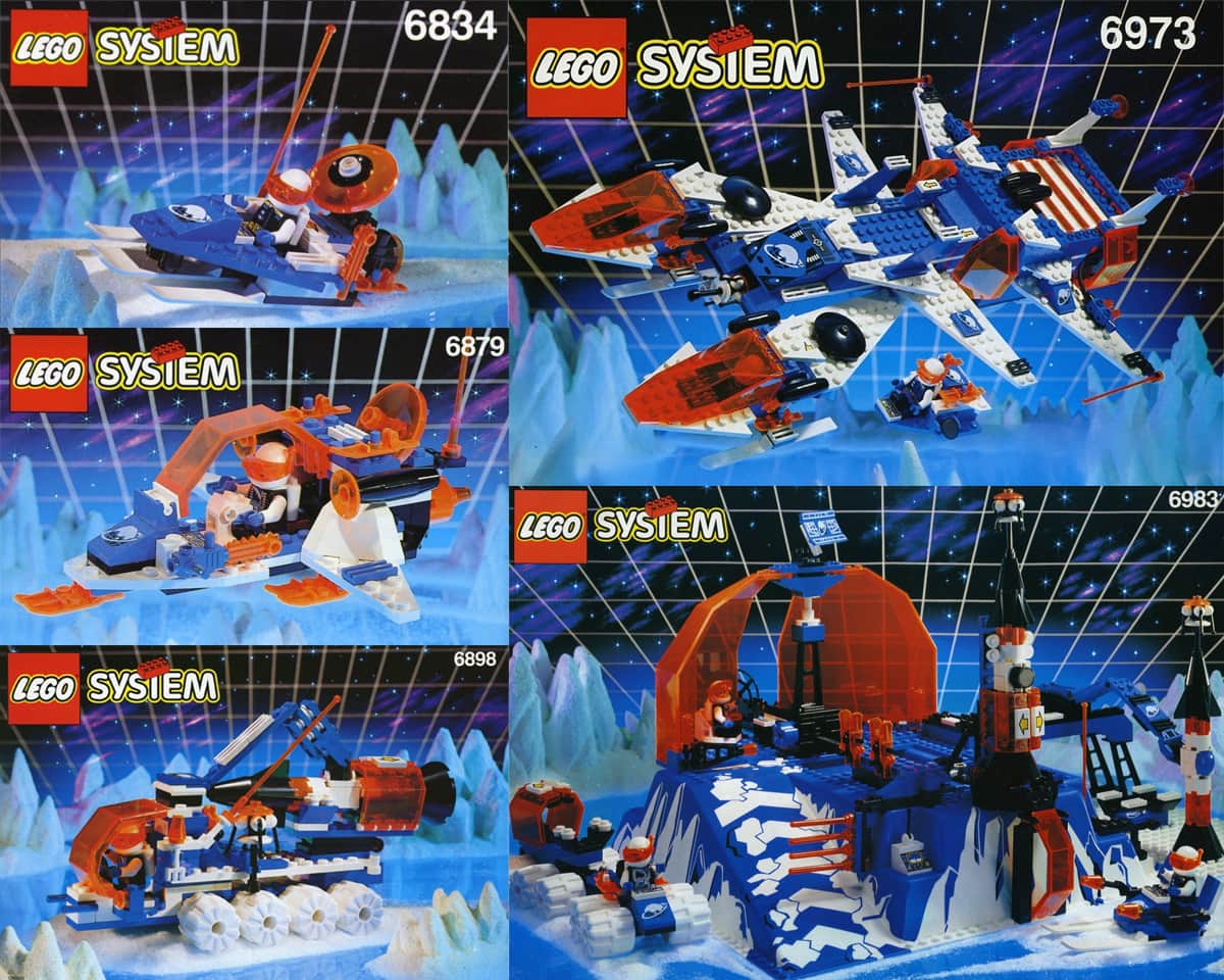
As you are no doubt aware each LEGO space theme/faction has a distinctive colour scheme that sets it apart from the others, and Ice Planet 2002 is no different, in fact, as you can see by looking through the original sets, the Ice Planet 2002 colour scheme is made up of just four colours.

With my Ice Planet Badlands build I plan on using the original colour palette of Ice Planet 2002 but expanding into a broader palette incorporating some of the newer colours that have been added to the LEGO palette since 1993.
Here is the palette that I have chosen. You can see how it expands on the previous palette, the aim being to broaden the colour palette, but also to still have the overall build appear as Ice Planet to the casual observer. Getting the balance of colour right in the finished build will be key to this.
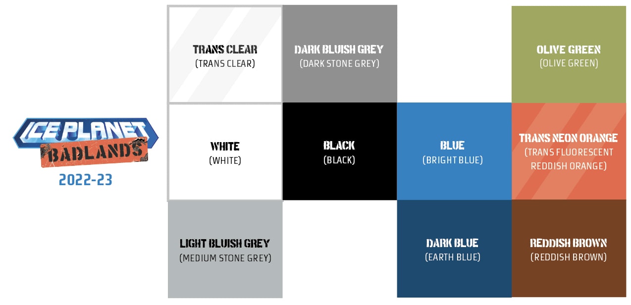
As with each of my builds I have identified what materials each of the colours will represent, this helps me to work out which parts I will need in each colour, here is an example of what the colours in the new palette may end up representing in the build:
- White will be applied pretty much the same way that it is in the original sets, representing painted metal and polycarbonate, but it will also be used for snow and ice as I will be building a large landscape.
- Light Bluish Grey will be used to represent concrete.
- Dark Bluish Grey will be used to represent stone and unpainted metal.
- Black will be applied pretty much the same way that it is in the original sets, representing painted metal and polycarbonate.
- Dark Blue will be used to represent corroded painted metal
- Blue will be applied pretty much the same way that it is in the original sets, representing painted metal.
- Trans Neon Orange will be applied pretty much the same way that it is in the original sets, representing polycarbonate and quartz glass.
- Reddish Brown will be used to represent rusted/corroded metal.
- Trans Clear will be used for ice crystals.
- Olive Green will be used for vegetation.
Edit 20th June: As I have been progressing with the build, I have revised my use of Light Bluish Grey and Dark Bluish Grey, to give them further distinction from one another.
Edit 8th/9th August: I have added another colour, that being trans clear which I am using in my ice crystals. I have removed Dark Azure and Dark Orange from the colour palette as I think the palette will be stronger if they are each replaced with more Blue/Dark Blue and Reddish Brown respectively. I have also added tan which will be used for vegetation to help break up all that white terrain.
Edit 4th October: I am replacing the tan in the palette for olive green.
So, what do you think, do you think my new palette will work?





[…] have decided to have a broader colour palette for Ice Planet Badlands, allowing for thirty years of changes and variations including handmade and […]
[…] but then again I have stated all along (even in the post this comment was responding to) that I am purposefully broadening the colour scheme, and I have given my reasoning for doing […]
[…] One of the reasons why I have chosen Ice Planet is because it has such a distinctive colour palette (a must have ingredient for a great build in my opinion, though I do plan to broaden it ever so slightly). […]