So, for just under a month now I have been planning, LDD-ing and purchasing pieces to start building my build for display at next year’s Brickvention in Melbourne. I have decided after tackling Neo-Classic Space in last year’s display, to this time take on another beloved classic LEGO theme from my childhood, Fabuland.
I have been thinking for some time about a way to approach Fabuland as a design style, rather than as a collection of specific pieces, in much the same way that Neo-Classic Space looks to Classic Space as a colour scheme and a set of design conventions. So what would the conventions be for Neo Fabuland?
Primary Colour Palette
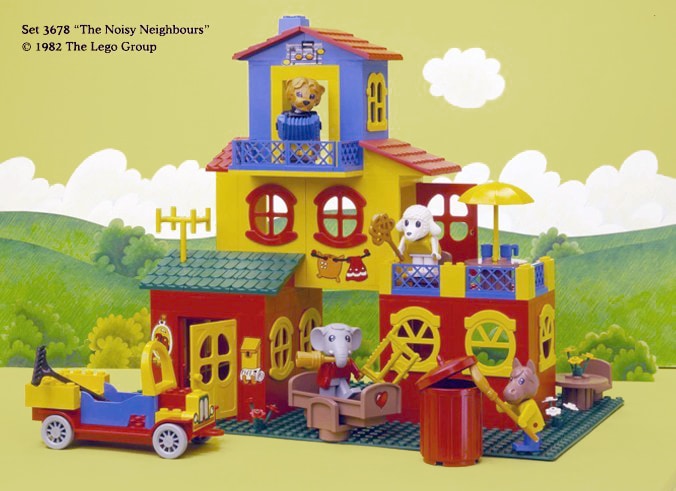
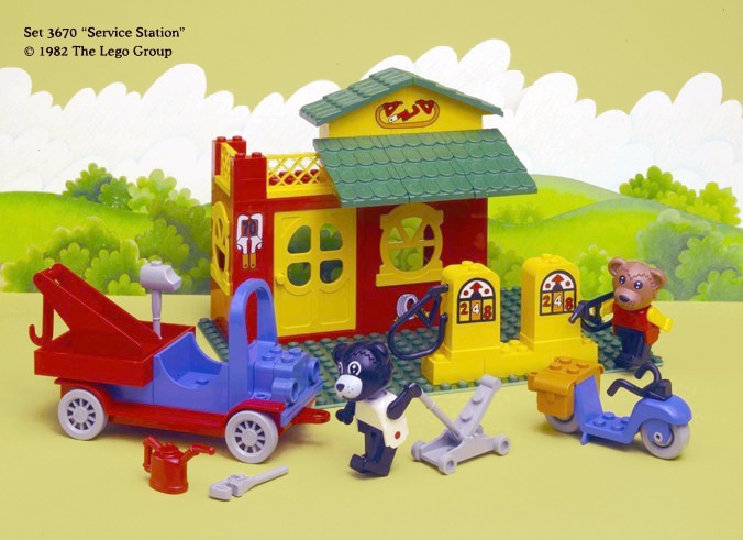
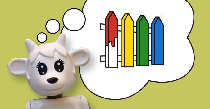
One of the things that appeals to me about Fabuland is its limited colour palette. The buildings and vehicles are primarily made up of four colours: red, blue, yellow and green, with some rare instances of white, black and grey mixed in. The full Fabuland colour palette is much broader and includes oranges, browns, lime green and tan. I plan on retaining the original colour scheme as much as possible, mainly using just the three primary colours in my buildings and vehicles (reserving green for grass and foliage) but also incorporating the other more natural colours to represent wood, stone, sand etc. It is important for me that my build reads as Fabuland at first glance, and I believe that keeping the same balance of colours as a original sets will be key to this.
Storybook Style
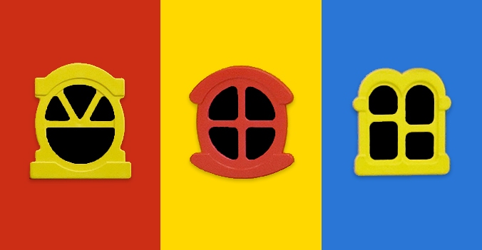
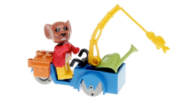
The seventies picture story book world inhabited by the anthropomorphised animals of Fabuland features buildings, vehicles and implements with an exaggerated, whimsical style not unlike childrens’ books at the time. Door and window frames appear rounded, vehicles have exaggerated, rounded features reminiscent of classic cars, implements are slightly over scale and decoratively styled rather than the more utilitarian designs of standard LEGO town implements. I believe that if I am going to truly capture the Fabuland style I will need to recreate this visual style as closely as possible in anything I build.
Unique Elements
Whilst I plan on using modern building techniques and pieces within my build I do not believe that it is possible to pay homage to Fabuland without incorporating the many original figures and distinctive parts that made Fabuland so unique. My Neo Fabuland build will be inhabited by as many original Fabuland figures and pieces as I can find (Viva la BrickLink)!
Handdrawn Lettering
The Fabuland sets feature pen and ink cartoon-like graphics for signs, house numbers, and even some physical objects. As with the architectural style, the overall style of these graphics is very reminiscent of picture story book illustration of the era and I plan on recreating the style in my own build in the form of custom decals for signage.

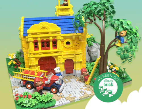
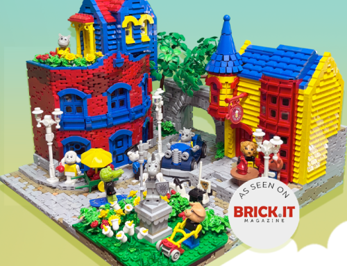
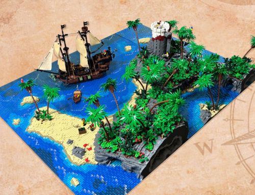
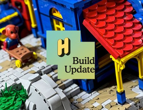

[…] last month’s post, Contemplating Neo Fabuland, I set out my idea to apply the design conventions of Fabuland as a visual style in my MOC for […]
[…] No Fabuland? No Problem! Building in Neo Fabuland style can be achieved with mostly regular bricks. Check out this great article on Harrisbricks all about it. This is also good for general Fabuland […]
Hi! I’ve just seen your island MOC and I absolutely love it! I was toying with the idea of actually letting my Fabuland collection free in the wild but seeing this it is a true inpiration to keep it and build it into something new. I completely agree with you, there is something magical about it :) Thank you!
Thanks Sandra, I would love to see what you build!
[…] am quite interested and excited to find out what they had to say about Boris, and my take on Fabuland in general, but I will need to wait for my copy to make its way from the UK to Australia before I […]
[…] The build in question, Boris’ Post Office is a Neo Fabuland post office build that was part of my large Neo Fabuland display which I built in 2019 and displayed in 2020, Edward’s Island, you can find out what my aims were for the Neo Fabuland project in my original blog post exploring the theme here. […]
[…] still plan to stick to most of my aims for Neo Fabuland from 2019, specifically the story book style, incorporating unique original elements from the original […]
[…] decided to start my Neo Fabuland build by building an homage to an original Fabuland set, the set I have chosen is 3660 from 1985, […]